From amazingly colorful antique relics to the attempts to standardize colors in biomedical imaging, color has gained relevance in the sciences. Yet the epistemic role of color, its long-standing neglect due to historically symbolic and partly gendered ascriptions, and the function of color in visualization for scientific purposes have not received much attention in the sciences or the humanities to date. The internal use of color in the sciences raises different epistemological questions from those that arise with images for external communication. The choice and symbolism of color in the latter case is guided to a greater degree by a need for simplification and considerations as to the expectations of a broader public. Coloured images for internal scientific use emerge during the research process itself (as a medium for self-reflection) or are produced in devices and used for intersubjective communication and to obtain feedback from the scientific community. Digital publishing has enhanced the use of color in scientific images, in contrast with the costly use of color in print media, whilst the globalization of the scientific community challenges the idea of universal color symbolism. All these issues raise the need for color awareness.
The conference “On the Epistemic Dimension of Color in the Sciences”1 invited speakers and participants to investigate the epistemic dimensions of color in the sciences, across the disciplines and across history: it was a meeting of researchers with expertise ranging from the digital and life sciences to gender studies and art history. They all shared an interest in the reflection on the historical understanding of color and of its contemporary uses in science and technology.
The conference kicked off with a keynote by art historian Ulrike Boskamp (Free University, Berlin) held at the site of the +ultra. knowledge & gestaltung exhibition at the Martin Gropius Bau Berlin, where the Cluster of Excellence Image Knowledge Gestaltung presented its research between 30.09.2016–8.01.2017. The exhibition provided a fitting context for the launching event of the conference and for Boskamp’s talk “Coding and Gendering Color: Scientific, Epistemological and Aesthetic Discourses in 18th Century France,” which laid the ground for recurrent comments on gender aspects in scientific color use in modern science throughout the conference: Boskamp discussed David Batchelor’s thesis on the longue durée of what he calls ”chromophobia“ (Batchelor 2000), showing its move from antiquity to the Renaissance (as already discussed in Jacqueline Lichtenstein’s ground-breaking study The Eloquence of Color, 1993) and into modern science. According to Batchelor, western cultures follow a binary concept of color versus line, coding the line (as in drawing and alphabetical text) in relation to cognition and the (white) male, versus color as directly addressing the senses and emotions, thereby categorizing it as female and (especially within the context of 19th century archaeological studies),2 as “oriental.”
Starting out by acknowledging the overall tendency of this color code by reference to the two central characters in Fifty Shades of Gray (fig. 1) (James 2012), Boskamp complicated this straightforward picture. She demonstrated how after the Cartesian understanding of color as “just” light, Netwton’s color theory made it possible for color to enter the scientific stage, to become an object of cognition in physics (fig. 2). The experimental approach to color, entangled with concepts of physically measurable color harmony (with the then primary colours yellow, red and blue, fig. 3), led to yet another shift sparked by Rousseau, among others. He built an argument on the opposition of mere ‘pleasure’ in such scientized corrupted color harmony (thereby female) and real ‘passion’ created by the use of the line in art. The justification of the hierarchic opposition between color and line thus had shifted from attributing the (achromatic) line with cognition to attributing it with masculine passion.

http://www.filmstarts.de/nachrichten/18481451.html (last access 13.06.2016), provided by Ulrike Boskamp.
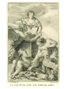
Le Coloris, Etching by Nicolas Ponce after Charles Nicolas Cochin (fils), from Antoine Marin Lemierre: La Peinture. Poëme en trois chants, Paris 1769, p. 20. Provided by Ulrike Boskamp.
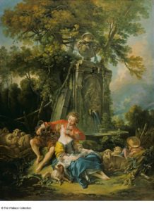
François Boucher, Autumn Pastorale, 1749, oil on canvas, 259,9 x 198,6 cm, London, The Wallace Collection. Provided by Ulrike Boskamp.
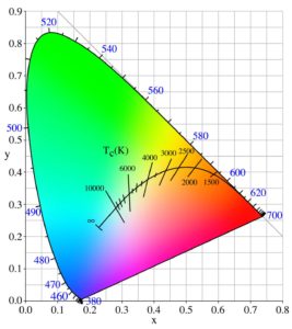
The first session of the second conference day, taking place at the central laboratory of the Cluster of Excellence Image Knowledge Gestaltung in Berlin-Mitte, was dedicated to the evolution of standards in analogue and digital color print and projection. The basis of these media, working up to today with a triad of colors, as Ricardo Cedeño Montaña (Institut for Cultural History and Theory, Humboldt-University and BWG) showed, ultimately figure in Young’s, and later Helmholtz’s, color receptor theory. Cedeño Montaña’s main point however, was to show that the step from analogue television to digital cameras meant bringing together luminance and chromaticity (fig. 4) – once separate from the body in the TV – towards the human eye. This, he stated, closed a circuit initiated by the CIE, the Commission Internationale d’Eclairage (International Commission of Illumination), who in its Colorimetric Resolution of 1931 constructed a standard observer with a standard perception of luminance and chromaticity. This was also a topic discussed by Wolfgang Coy (Computer Sciences, Humboldt-University and BWG): the standard observer was developed together with the so-called horseshoe, the spectrum of differentiable colors measured in wavelengths which at a certain point merged to become white. This horseshoe followed a universal concept assuming that “the tested 20 caucasian males” were representative for any culture and historical situation an observer could be embedded in. Interestingly though, as Coy showed, the crossing wavelength that resulted in white moved in the diagram of the horseshoe during its evolution over the next decades. The presentation of the concept of the standard observer was followed by a discussion about the im-/possibility of a transcultural and ahistorical perception of color sparked by a doubtful biologist: wouldn’t people brought up in Ireland or in the Amazonian rainforest be able to differentiate more shades of green than people brought up in the arctic?
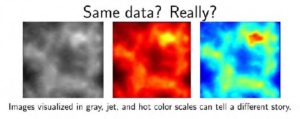

The keynote by Aldo Badano (Center for Devices and Radiological Health, FDA, USA) addressed this issue of individual or collective learning of color perception and interpretation within the realm of medicine: in his talk on “Color Visualization in Medical Images” the Chair of the AAPM task group “Requirements and Methods for Color Displays in Medicine” discussed his empirical project on the question of whether the use of color in medical images was relevant, for example, in reaching a correct diagnosis (fig 5.). Few years ago before the medical imaging community began to become interested in consistency in image visualization there was no knowledge about assumptions of color effectiveness nor on whether there was any reliable difference between the performance of gray scale versus the so-called jet scale (using rainbow colors). Badano’s group (Zabala-Travers et al. 2015) found that attitudes towards the performance of both differed much among clinicians and that these expectations didn’t meet experimental results when comparative tests were done using as example the detection and localization of cancer. Badano stated in the discussion that the role of training was of rising relevance, as color imaging became more frequent while training with such visualization didn’t; on the other hand, the same holds for the reversed situation, especially as medical practitioners move between countries, continents and thus medico-technical cultures.
Taking a clearer position regarding the effectiveness of the rainbow color map than Badano’s results, Daniel Baum (Zuse-Institute, Berlin and BWG ) in his talk on “Data Visualization Perspective on the Use of Color” discussed its disadvantages, such as its non-linearity and lack of perceptual order. For those professionally visualizing data, the main questions in the choice of color scale are what the type of data attribute is, what the task to be carried out entails, whether we work with 2D or 3D data, and who the audience is. Besides educated choices, contingent ad hoc decisions may lead to perpetuated color codes, as exemplified in the case of atom colors, which are the result of August Hoffmann using cricket balls as a model in a 1865 presentation (fig. 6).
A cultural history oriented session started with Linda Baéz Rubí (The Warburg Institute, London; Instituto de Investigaciones Estéticas, UNAM and BWG ), who discussed the appearance of the Virgen de Guadeloupe in 1531, a painting of the Virgin Mary at a mountain in the north of the city of Mexico. The different stories about the inexplicable appearance of the image in the following century led to an entrenchment of physical theory and proof of God’s existence. To convince the Pope and the Congregation of Rites of the apparition in the 16th century Luis Becerra Tanco, a Creole Jesuit and mathematician and astronomer at the University of Mexico explained the apparition according to the model of optical geometry, which makes use of the medieval theory of the perspectiva communis. In 1756 the painter Miguel Cabrera explained: since the colors in the image didn’t change over time, it had to have been created by God – and vice versa. Nils Güttler (ETH Zurich) in his talk on the Justus Perthes’ map workshop in Gotha demonstrated the “Perthes style” in maps at the turn of the 20th century between science and marketing. The symbolism and political iconography included a distinction between Europe with golden-yellow borders in contrast to Africa in red, then connoted, i.a. in Rudolf Steiner’s work, as bellicose. Map coloring was female labor in all map workshops, with 160 women in Perthes’ workshop alone – the pedagogical discourse in girls’ and boys’ schools early on brought girls to color and boys to technical drawing, which in the discussion of course allowed for a loop back to Boskamp’s talk. This linking of color and female work was further transposed into photography and film, where the colorists also were mainly female.
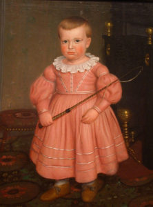
“Boy with whip“, anonymous, American School, circa 1840-1850, Honolulu Museum of Art, commons wikimedia, last access 4/14/2017, provided by Isabelle Grisard.
Margrit Vogt (Institute for Language, Literature and Media, University of Flensburg) and Dominique Grisard (Honorary Visiting Fellow, City University London) in their respective talks analyzed the history of scientific studies on the cultural use of color. Vogt drew attention to the fact that only since 1900 did colors begin to be produced as stable colors through a mix of technique and science, consumer culture and arts, which in addition to the introduction of electrical light at the beginning of the 20th century helped change the focus on color: its relevance in art and science was no longer the essence of colour as a static phenomenon, but rather the visual effect of one color in relation to another. The conference closed with Grisard’s talk on scientific theories that try to explain a supposedly female color preference for pink in evolution theory as well as in psychology since the early 1990s (fig. 7). The phenomenon was referred to in evolutionary psychology as “archaization”, placing sources of this preference in the female biological constitution as already indicated in 19th century biology – again looping back to the beginning of the conference with the keynote on the historical linkage of the femininity and color.
1 The conference took place on Nov. 17th and 18th, 2016 at the Cluster of Excellence Image Knowledge Gestaltung (BWG), Humboldt University, Berlin, organized by its research associate Bettina Bock von Wülfingen and co-chaired by the BWG-members Jochen Hennig, John Nyakatura, Kathrin Amelung and Martin Grewe.
2 Alexander Nagel (Department of Anthropology, Smithsonian Institution, National Museum of Natural History, Washinton D. C.), expert i.a. on the history of the “whitening” of near east antique architecture and sculpture during 19th and 20th century archeology, was hindered for health reasons.